
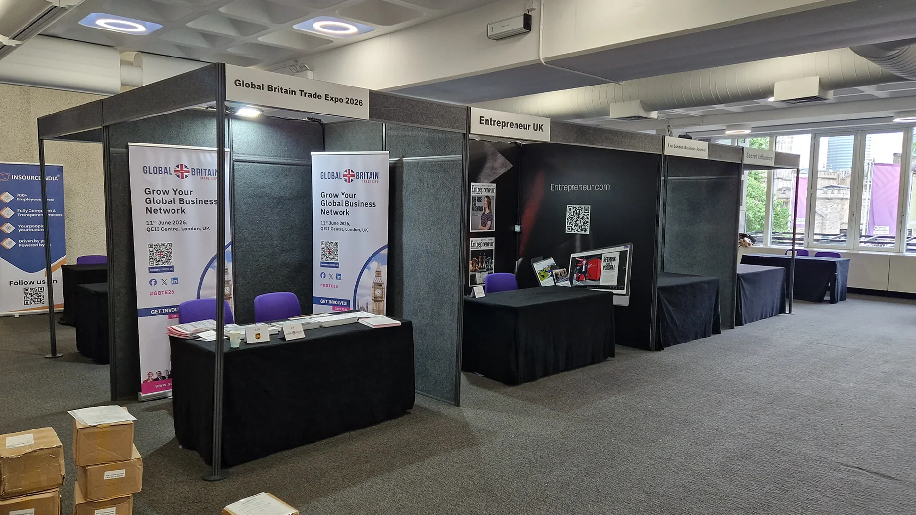
When designing events, three basic rules make everything work: start with clear goals so you know exactly what the event needs to achieve, design the space around the attendee journey and flow so it feels easy and intuitive to navigate, and keep all visuals, colours, fonts, signage, screens, and print telling one consistent story from the first invite to the final goodbye.
Everyone’s been to that event.
The one where you can’t find registration, the keynote is hidden behind a pillar, the signage conflicts with itself, and you spend more time guessing than listening. Nobody remembers the content; they remember the confusion.
Then there are the others: the shows and conferences that just “feel right.” You know where to go. You know what’s happening. The stand or stage looks like it belongs to a team that has its act together. The difference isn’t luck. It’s design.
Let’s break those down into something you can actually use.
Rule 1: Start With Clear Goals, Not Pretty Ideas
Good event design starts by being brutally clear about why you’re doing the event, who it’s for, and how you’ll know it worked; the colours and furniture come later.
A lot of event design goes wrong because it starts with mood boards, not outcomes. The best-performing stands and events do the opposite: they begin with objectives, audience and budget and design everything else to serve those.
Research on event design and “eventscape” (the physical environment of an event) shows that when the environment supports clear goals and expectations, it strongly influences satisfaction and loyalty.
In other words: design that knows what it’s trying to do, works.
Here’s how to nail that.
1. Ask “Why This Event, Right Now?”
Be specific:
- Are you launching something?
- Trying to build a pipeline or book demos?
- Driving education and thought leadership?
- Hosting internal teams to boost morale or alignment?
Your answer should be clear enough that you can finish this sentence: “If this event is a success, we will have achieved X with Y audience.”
2. Decide Who The Event Is Really For
“Everyone” is not a target audience. Define:
- Which segment do you care about (industry, role, seniority)?
- What are they trying to solve?
- How do you want them to feel and act after the event?
Event design studies consistently show that when attendees feel an event is designed around their needs, their satisfaction and emotional response go up.
3. Set A Handful Of Simple Success Metrics
You don’t need a PhD in analytics. Pick a few measures that actually matter:
- Number of qualified conversations.
- Number of demos* or meetings booked.
- % of attendees who say the event was “valuable” or “very valuable”.
- Number of follow-up calls or proposals sent.
Keep them visible when you’re making design decisions: if something doesn’t help those numbers, question it.
4. Put It All On A One-Page Brief
Capture:
- Purpose
- Audience
- Key message
- Success metrics
- Budget and constraints
Share this with your internal team and your external suppliers (stand builders, shell scheme providers, AV, graphics). It keeps everyone designing the same event, not their own private version.
Rule 2: Design The Attendee Journey And Flow
If you want people to enjoy your event, design for how they move, where they pause, and what they see at each step, not just how the room looks in an empty floor plan.
Studies on exhibition and event layouts keep saying the same thing: flow and layout are crucial to comfort, networking and engagement. When the layout supports natural movement, people stay longer, interact more and leave happier.
Think less “pretty picture,” more “journey map.”
- Map the Journey Like a Guest, Not a Planner
Start outside the room in your head:
- Arrival: Where do they see the event branding first? Is registration obvious?
- First impression: What’s the first thing they understand? Chaos or clarity?
- Main zones: Where are the key stands, stage, catering, and quiet spaces?
- Moments that matter: Where do they decide to stay, sit, talk, or leave?
Visitor-journey guides for exhibitions recommend walking the space from an attendee’s perspective and designing with empathy: clear entry points, intuitive routes, and clear sightlines.
- Create Clear Zones, Not Clutter
Give your space jobs:
- Welcome / Registration.
- Main showcase or stage.
- Demo or interaction.
- Seating and networking.
- Tech/control/storage (ideally hidden).
Dividing your stand or event into zones with specific messages and activities is a proven way to make the attendee journey feel intentional and easier to navigate.
- Use Wayfinding That Doesn’t Need A Translator
Signage is one of the cheapest design tools you have, and one of the most powerful. Good wayfinding and informational signage:
- Uses simple language and consistent names
- Sits at eye level and in high-traffic spots.
- Uses contrast and large fonts so nobody has to squint.
- Combines arrows, icons and short labels (e.g., “Stage A”, “Workshops”, “Quiet Room”).
If people constantly stop staff to ask “Where is…?”, you don’t have an information problem. You have a design problem.
- Make Comfort Part Of The Brief
Design isn’t just what people see, it’s how they feel in the space: temperature, sound, seating, crowding.
- Provide enough seating near key zones.
- Keep lighting soft enough to be flattering, strong enough to feel safe.
- Think about acoustics: can people hear the speaker, or is the PA fighting the bar?
- Include quiet corners or side areas where people can take a call or reset.
A lot of this is easier when you work with a full-service exhibition partner, for example, trade show contractors in London who handle shell scheme layouts, display boards , carpet & flooring, furniture and AV under one roof. They’re used to shaping flow at venues like ExCeL and Olympia, not just filling square metres.
Rule 3: Make Your Visuals Tell One Clear Story
Your event should look like one idea, not twelve competing ones. Colours, fonts, lighting, and screens should all repeat the same story until it’s unmistakable.
Event design research talks about environment, brand expression, sensory engagement and user flow as the core of strategic design. The visuals are where most attendees will feel that immediately.
- Choose A Small, Disciplined Colour Palette
Two main colours and one accent are usually plenty:
- Primary (around 60% of what people see).
- Secondary (around 30%).
- Accent (around 10%, buttons, highlights, callouts).
Use them on:
- Stage backdrops.
- Signage and wayfinding.
- Slides and printed materials.
- Staff clothing or lanyards.
Consistent colour and brand elements make recognition almost automatic.
- Keep Fonts And Graphics Under Control
Pick one or two font families and stick to them across:
- Invites and landing pages.
- Social media graphics.
- On-site signage and printed pieces.
- Screen content (slides, lower thirds, overlays).
Too many styles and clip-art graphics make even an expensive event look cheap. Clean and consistent feels confident.
- Use Lighting And AV As Part Of The Story
Lighting and AV aren’t just “production”; they’re part of your visual language.
- Use warm lighting for hospitality and networking, cooler for tech-heavy demos.
- Highlight key areas: stage, hero stand, feature demo.
- Consider digital signage or LED screens instead of a forest of pull-up banners.
This is where working with exhibition suppliers who offer audio visual hire and printing & graphics together makes life easier. One team controlling screens, lighting and print means your story actually matches across everything.
- Match Digital And Physical Touchpoints
Whatever people see on:
- The event website.
- Email invitations and confirmations.
- Social posts leading up to the event.
…should feel like the same event they walk into.
Use the same colour palette, typography, key phrases and imagery. When there’s continuity from the first email to the final goodbye at the exit, the whole experience feels more intentional and more trustworthy.
A Simple Event Design Checklist You Can Reuse
Before sign-off, run every event through one short checklist: goals, journey, visuals. Here’s a quick version you can print or drop into your project doc:
- Have we written a one-page brief with purpose, audience, key message and 3–5 success metrics?
- Have we walked the journey from arrival to exit and removed obvious friction points?
- Are zones and wayfinding clear at a glance for someone who’s never been here before?
- Is there enough seating, light, sound control and comfort for the time people will spend with us?
- Do our visuals (online and on-site) look like one story, not a collage of ideas?
- Do our suppliers (stand build, shell scheme, AV, graphics) understand the same goals, not just the measurements?
If you can tick those with a straight face, you’re already ahead of most events.
Design Is The Part Guests Can’t Explain, But Always Feel
Event design isn’t just décor. It’s the invisible hand that decides whether people feel lost or welcomed, bored or engaged, drained or energised. You don’t have to build the biggest stand or the flashiest stage. You do have to be clear and deliberate:
- Start with goals, not pretty pictures.
- Design the journey, not just the room.
- Let your visuals tell one simple story, over and over again.
Do that, and your next event won’t just look good in photos. It will work for your guests, your team, and the people asking about ROI afterwards.
And if you don’t want to hold all of this alone, that’s where experienced exhibition and trade show partners like EMS Exhibitions come in, who provide shell scheme hire, display boards, furniture, carpet & flooring, audio visual hire and graphics under one roof. We bring the kit and the know-how; you bring the brief that says why it all needs to happen.
FAQs
What Is Event Design In Simple Terms?
Event design is how you shape the environment of your event, the layout, visuals, signage, lighting and flow, so people can move easily, understand what’s happening and feel the atmosphere you want. It’s the difference between “things in a room” and “an experience”.
Why Is Layout And Flow So Important At Events?
Because people don’t experience your event as a floor plan, they experience it as a journey. Good flow makes it easy to find what matters, meet people and stay engaged. Poor flow leads to confusion, bottlenecks and missed content.
How Early Should I Start Thinking About Event Design?
As soon as the event is confirmed. The earlier you lock goals, audience and basic layout, the easier it is to brief suppliers, control costs, and avoid last-minute compromises on things like signage, AV and furniture.
What’s The Most Common Mistake In Event Design?
Starting with “How do we make this look impressive?” instead of “What do we need this event to achieve for these people?” That’s how you end up with beautiful spaces that don’t actually work for attendees or for your KPIs.
Do Small Events Really Need Professional Event Design?
They need intentional design, not necessarily a massive budget. Even a small internal event benefits from clear goals, simple wayfinding, decent lighting and consistent visuals. Whether you bring in a supplier depends on complexity, not just size.