
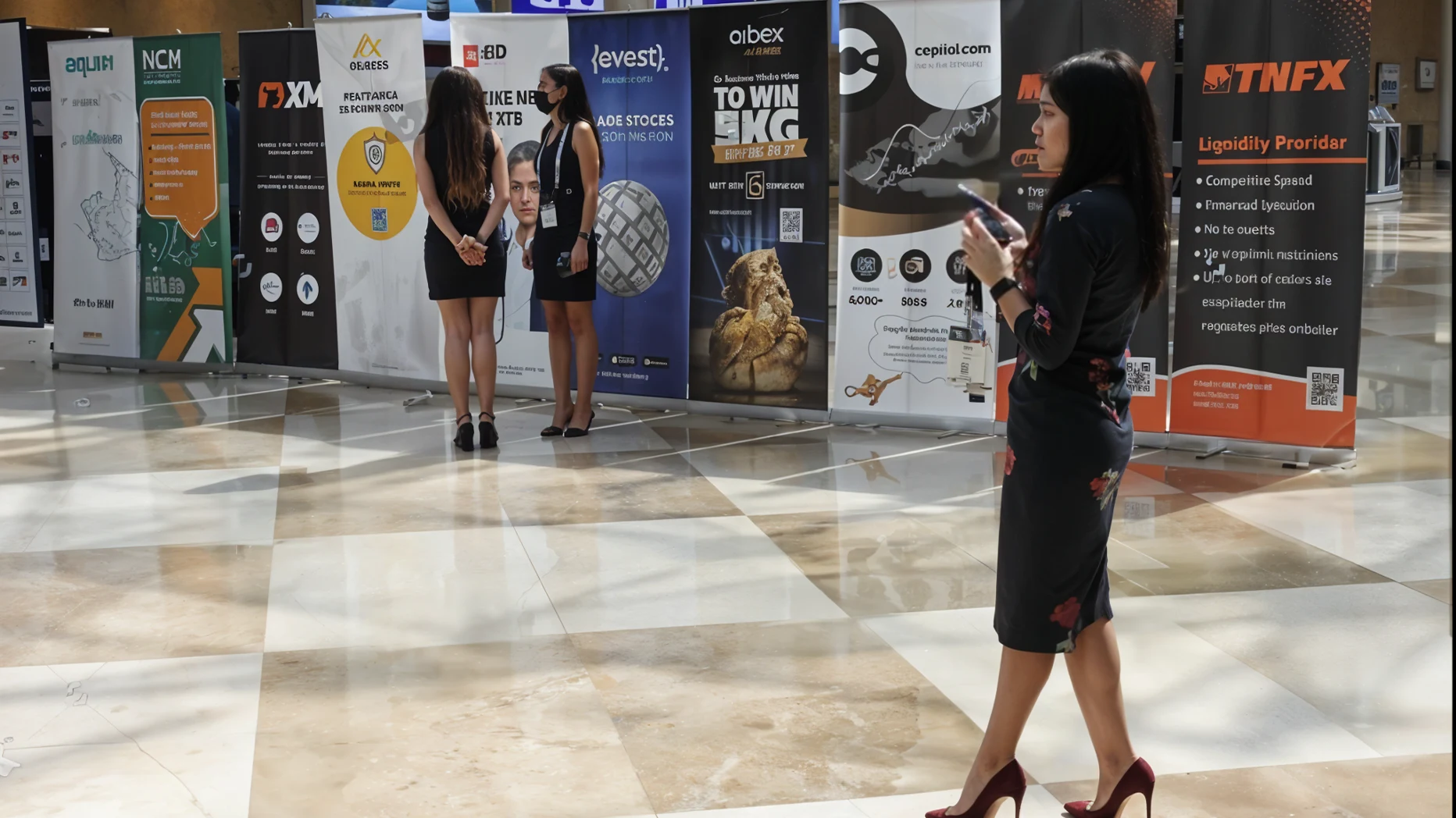
To make your trade show banner outstanding, focus on simplicity, strong visuals, and one clear message. Use bold colours, readable fonts, and strategic lighting to make your booth instantly recognisable. A good banner doesn’t just decorate your stand; it starts conversations before you say a word.
Walk through any trade show hall and you’ll see it: a blur of banners, flashing screens, and competing slogans. Most fade into the noise. But every once in a while, one banner stops you in your tracks. It’s not just bigger or brighter; it’s smarter. It tells a story in seconds, speaks clearly from a distance, and feels like it belongs to a brand that knows what it’s doing.
That’s the power of an outstanding trade show banner. It’s not about shouting for attention; it’s about earning it through clarity, design, and purpose.
In this guide, we’ll look at how to design a banner that commands attention, reinforces trust, and leaves a lasting mark on everyone who passes by.
Why a Great Banner Still Matters?
Even in a world of digital screens and LED walls, banners remain the anchor of every exhibition stand. They frame your brand, create instant recognition, and draw visitors before you even speak.
At a trade show, people are surrounded by noise, bright lights, overlapping pitches, and endless marketing. The right trade show banner cuts through that clutter. It’s the first handshake, the first impression, and often the reason someone stops walking.
Think of it this way: a good product might win you customers, but a strong banner starts conversations.
Start with Purpose, Not Decoration
Before choosing colours or fonts, decide what your banner needs to do. Is it attracting foot traffic, promoting a launch, or reinforcing brand awareness?
Every design choice should support one simple message. Too many ideas compete for attention; one clear message creates focus.
When planning your visuals, remember the natural reading pattern, top to bottom, left to right. Your logo should anchor the top, your headline should live in the middle, and your key callout should land at eye level. Everything else is supporting detail, not competition.
If you’re using Custom Exhibition Stands, your banner should complement the stand’s shape and flow, not fight it. Design them together. They’re one story told in two dimensions.
Visual Hierarchy: Guide the Eye
A banner’s success depends on how fast it communicates. Most visitors decide within three seconds whether to stop or move on, so hierarchy is everything.
- Headline: 5–7 words that explain your value. Think “Design that moves” or “Power, simplified”.
- Subtext: A short phrase that adds context, with no jargon and no filler.
- Visuals: One strong image beats five small ones. Let colour and shape carry emotion.
Don’t fear white space. Empty areas give the eyes room to breathe and make key details pop. Simplicity feels confident, and confidence draws attention.
The Power of Colour
Colour speaks before words do. Use it wisely.
- Blue builds trust and calm, ideal for tech or finance.
- Red drives energy and excitement, perfect for consumer brands.
- Green suggests sustainability, freshness, and balance.
- Yellow conveys optimism and innovation.
Whatever your palette, keep it consistent across your booth, literature, and digital screens. A unified colour story strengthens brand recall.
For added impact, align your colour choices with your lighting. Backlit panels or subtle spotlights can bring colour to life and make your message visible even from a distance.
Typography That Speaks Clearly
Your words matter, but only if people can read them. Fonts that look stylish on a laptop often vanish on a large banner.
Go bold, simple, and generous with spacing. Sans-serif fonts like Helvetica, Futura, or Montserrat work well at scale. Avoid thin scripts or decorative fonts that blur under bright lights.
A good rule of thumb is this: If it can’t be read from six metres away, it doesn’t belong on a banner.
Images and Graphics That Pop
Photography and illustration both work; what matters is clarity. Choose one hero image with strong contrast and professional resolution.
Avoid stock-photo clutter. Real product shots, candid team moments, or abstract visuals that mirror your brand tone feel more authentic.
Large-format printing helps maintain crispness at any scale. If your stand uses a shell scheme hire setup, seamless fabric or vinyl wraps can integrate your banner directly into the wall, avoiding awkward seams or gaps.
Size, Scale, and Placement
Bigger isn’t always better, but visibility is non-negotiable.
The banner should align with the average visitor’s eyeline: roughly 1.6 metres from the ground for key text, and 2.5 metres for logos or headlines meant to be seen from afar.
If you’re exhibiting in an island or corner stand, consider adding overhead elements or hanging signs for 360-degree visibility. Keep lighting balanced to avoid glare, especially on glossy materials.
Lighting: The Hidden Hero
A banner’s visibility often depends on how it’s lit. Dull hall lighting can flatten even the best design.
Use soft LED backlighting to highlight text and bring colours to life. For more advanced setups, spotlights or edge-lit frames can direct attention exactly where you want it.
Lighting should feel warm and intentional, never harsh or uneven. Good light says professional before anyone reads a word.
Crafting the Message
Keep the copy short, but the impact strong.
Your trade show banner should read like a headline, not a paragraph. Skip filler words and focus on what the visitor gains.
Examples:
- “Innovation You Can Touch.”
- “Built for Bold Ideas.”
- “Where Vision Meets Reality.”
Pair your headline with a simple call to action: “Visit Booth A32,” “See the Demo,” or “Talk to Us Today.” Visitors shouldn’t have to guess what happens next.
Make It Interactive
Static visuals work, but movement keeps people interested. Integrate a small screen, QR code, or motion-activated light sequence to bring your message to life.
QR codes are especially effective when space is limited. Link them to product demos, digital brochures, or lead-capture forms. Just make sure the landing page works smoothly; a broken link can undo the strong first impression your banner made.
Interactive doesn’t have to mean high-tech. A textured material or layered graphic can be enough to invite touch and curiosity.
Brand Consistency and Reusability
Your banner shouldn’t feel like an afterthought. It’s part of a visual ecosystem that includes flooring, counters, and furniture.
Maintain consistency in tone, colour, and logo placement across all materials. Mismatched elements make a booth feel improvised; alignment makes it memorable.
If you attend multiple shows each year, design banners that adapt. Modular or fabric banners can be reused, reducing both cost and environmental impact.
Pair your banner with coordinated furniture and finishes from Event Furniture Hire to complete the look and keep the overall booth cohesive.
Common Design Mistakes to Avoid
Even good brands slip here:
- Too much text. Visitors will not read paragraphs while walking past.
- Low-contrast colours. Pastels on white disappear under bright lights.
- Overlapping fonts or images. They confuse the eye.
- Ignoring lighting. What looks perfect on screen might vanish in the hall.
- Inconsistent branding. Every banner should feel like the same voice.
Before final printing, step back three metres and ask: Can I tell what this company does in three seconds? If not, simplify.
Measuring What Works
You can’t manage what you don’t measure. Track how your banner performs by observing where visitors stop, how often they photograph your booth, or which messages draw the most conversation.
Post-event, compare lead quality and engagement to previous shows. If the booth felt busier, note what changed: colours, lighting, or messaging.
According to Exhibitor Online, visual consistency across displays can increase brand recall by up to 60%. That’s proof that small design adjustments can have large returns.
Design Banner That Speaks Before You Do
A banner isn’t just a backdrop; it’s your booth’s storyteller.
When colour, message, and placement align, your trade show banner becomes more than fabric and ink; it becomes instantly recognisable. Visitors feel they already know you before you say a word.
Design with empathy. Light with intention. Speak simply. Because in a hall full of noise, the quietest confidence always stands tallest.
FAQs
What makes a trade show banner effective?
Clarity, strong colour contrast, readable text, and one focused message.
What is the best material for banners?
Fabric or high-quality vinyl for durability and vibrant printing.
How large should a trade show banner be?
It depends on booth size. Ensure text is legible from 3–6 metres away.
Should banners include QR codes?
Yes, when they lead to useful, mobile-friendly content or demos.
How can I reuse my banner for future shows?
Opt for modular designs and neutral messaging that adapt to multiple events.