
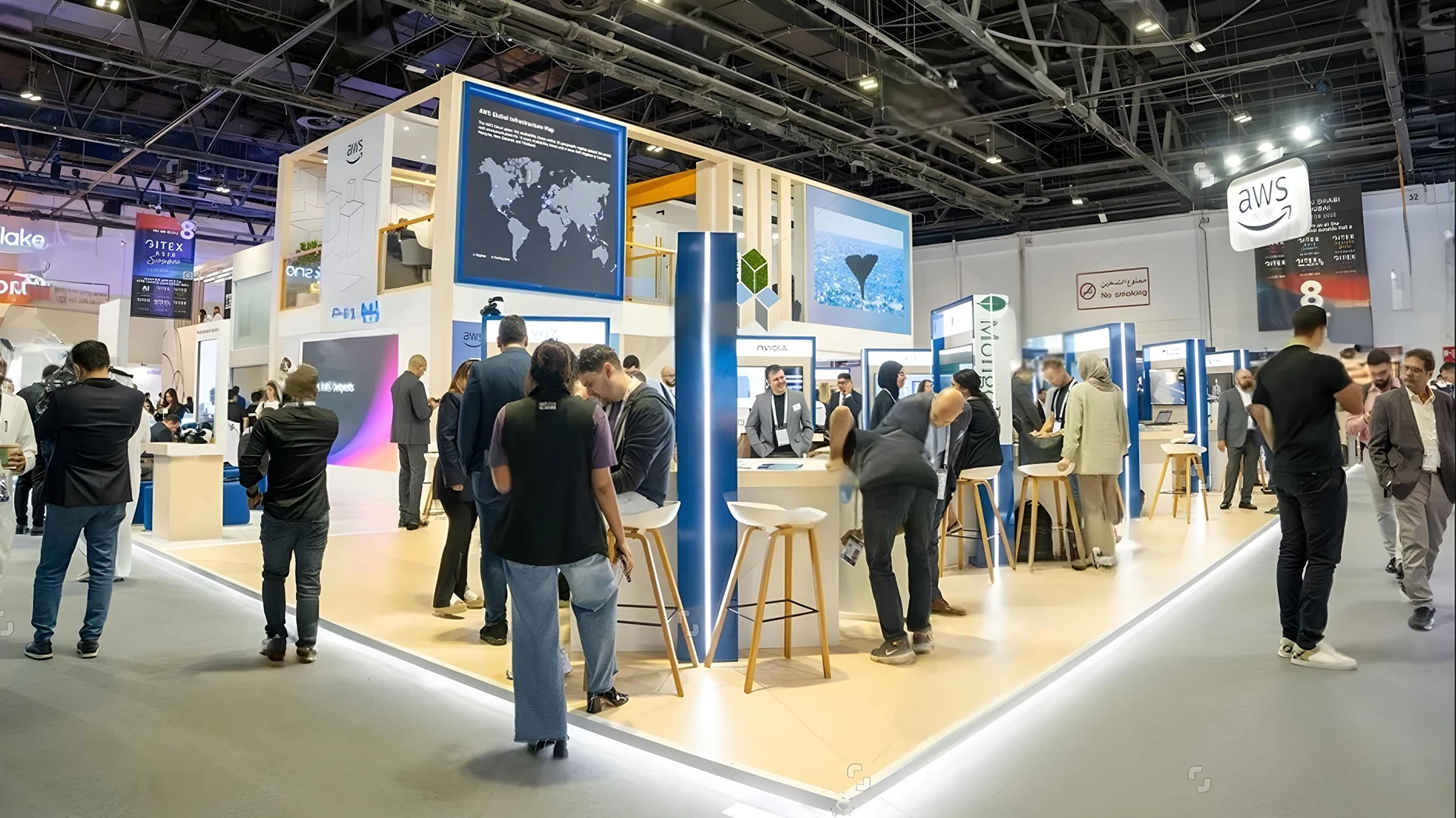
Standing out on a crowded trade show floor isn’t about being the loudest or flashiest. It’s about intention, exhibit design that tells one clear story, uses light and space with care, and makes people feel something real when they step inside.
Walk into any major exhibition hall, and it feels like stepping into a controlled chaos, flashing LEDs, overlapping soundtracks, and aisles packed with logos. Every company is trying to shout the same message: look at us.
But most booths blur together within minutes. What stops people isn’t noise; it’s calm confidence. When your exhibit design feels considered, when it gives eyes a place to rest and minds a reason to linger, that’s when you win attention that lasts longer than a glance.
The Psychology of Attention
Our eyes are drawn to order in a storm. According to Event Industry News, people decide in about three seconds whether to stop at a stand or walk past. Those three seconds depend on one thing: clarity.
An effective trade show booth design guides the gaze: one message, one emotion, one focal point. Instead of filling every inch with graphics, use empty space like punctuation. The pause is what makes people look twice.
At EMS Exhibitions, we’ve seen this again and again: restraint earns curiosity faster than spectacle.
Design That Speaks Before You Do
Your stand is your first handshake. Before a single word is spoken, visitors read your brand through shape, colour, and light.
Good exhibit design translates values into visuals. If innovation drives your brand, lean toward sharp lines, reflective surfaces, and clean lighting. If sustainability defines you, use natural tones, wood textures, and living walls.
A custom exhibition stand lets you tell that story without clutter. Every panel, banner, and material choice becomes a sentence in a larger conversation.
Using Space and Height with Purpose
On a crowded floor, visibility matters. Height gives it to you.
Hanging signs, tower structures, or layered displays pull the eye from across the hall. Even within smaller stands, vertical design creates depth with banners above, mid-level lighting, and key visuals at eye height.
Smart structure starts with flexibility. Shell scheme hire systems make it easier to scale up or reshape layouts between events, helping you keep your presence without rebuilding from scratch.
Lighting, Texture, and Movement: The Silent Differentiators
Light is emotion made visible. Soft backlighting warms a space; cool whites sharpen it. Highlight what matters: your product display, a logo, or a hands-on demo area.
Texture adds depth too: brushed metal for modern brands, fabric for warmth, and polished wood for elegance. Even subtle movement, like slow-turning screens or rotating product columns, catches attention without chaos.
AV hire in London can bring these layers together through dynamic lighting, video walls, or sound design that guides people naturally through your space.
Telling a Story Through Design
Every great booth tells a story, one that visitors can understand in seconds and remember for days.
A strong theme ties graphics, materials, and staff messaging together. Maybe your brand story is about innovation, reliability, or creativity; that theme should be clear in every element, from flooring pattern to backdrop image.
When form and story align, your booth doesn’t just stand out, it resonates. People don’t recall shapes and colours; they recall how your space made them feel.
Creating Interaction and Immersion
A static booth is background noise. A booth that moves, invites, and responds stays alive.
Interactive demos, AR experiences, or touchscreens turn visitors from spectators into participants. Even low-tech ideas such as a small workshop, quiz, or live product trial can work wonders. The goal isn’t to impress with technology; it’s to connect through experience.
Well-timed presentations or short “mini-shows” keep energy flowing and give passers-by a reason to pause. In the end, participation equals memory.
Comfort, Flow, and the Human Element
The human part of design is often forgotten. Visitors won’t stay where they feel cramped or ignored.
Plan your layout for flow: open entry, natural routes, and clear exit points. Add comfort where possible: a soft seat, a water station, or a small chat zone. These details tell people your brand notices how they feel.
With Event Furniture Hire, you can match form with function: sleek stools for demos, lounge chairs for meetings, and counters that double as storage.
Because when people feel comfortable, they open up, and that’s when conversations turn into leads.
Local Touches and Cultural Connection
Design that acknowledges place always lands deeper. Local architecture, familiar materials, or regional motifs can create instant rapport with visitors.
If you’re exhibiting in London, a subtle nod to the city’s industrial lines or art-deco textures adds warmth without cliché. In Dubai or Paris, colour and pattern might carry that local note instead.
The goal isn’t imitation. It’s a connection. A booth that feels rooted in its environment stands out because it feels considerate.
Avoiding Common Design Mistakes
Most exhibits fail for the same few reasons: too many messages, too little light, and no breathing room.
Overbranding turns clarity into clutter. Poor lighting hides good ideas. And overcomplicated tech distracts from your core story.
Keep your exhibition stand design simple, visual, and visitor-first. Every element should answer one question: Does this help someone understand us faster? If not, leave it out.
When in doubt, simplify. Confidence is quiet.
Measuring What Worked
Standing out is one thing; knowing why it worked is better.
After every show, track dwell time, visitor questions, social mentions, and post-event inquiries. These reveal which parts of your booth resonated most.
Exhibitor Online notes that exhibitors who analyse visitor flow data see up to 40% higher ROI at future events. Measurement turns instinct into insight, and insight into better design next time.
Conclusion
The best exhibit design doesn’t fight for attention; it earns it through clarity, emotion, and purpose. Crowded halls will always exist. The trick isn’t to shout louder. It’s to speak truer. Good design gives space for that truth to land: bold enough to be seen, calm enough to be trusted.
If your next booth does nothing else, let it feel human. Let it breathe. Because when visitors feel understood inside your space, they don’t just remember the design, they remember you.
FAQs
What makes an exhibit design stand out?
Clarity, flow, and emotional connection. It’s less about size, more about focus.
2. How important is lighting in exhibition design?
Critical, lighting directs attention, sets tone, and makes graphics readable.
3. Can a small booth compete on a crowded floor?
Absolutely. With good layout, height, and strong messaging, small spaces can feel big.
4. What trends define exhibition design in 2025?
Modular builds, sustainable materials, and interactive storytelling lead the list.
5. How can technology improve engagement?
Used wisely, tech like AR or live data screens invites curiosity without overwhelming visitors.